Legacy
Design and development of digital products in HMH was initially set up with much print design legacy.
• Content division was based on print page sizes
• Was often excessively long on screens
• Excessive accessibility bugs
• Assets did not follow best-practice for digital content
• Design quality far below par for the market position
The process used patterns but was based on a vendor model where revolving teams of offshore coders worked on task-level only, constantly losing knowledge as the teams shifted.
• Disconnection between the back end, front end and the design produced bloated, conflicting code and sub-par visual and end-user experience
• The over-the-fence approach gave no platform for learning or growth between front-end development to the design team
• No holistic vision of product development
• Poor morale on internal teams
Visiting students in US schools to see how they worked

We saw the issues with technology in schools
Discussions with teachers

Initial analysis
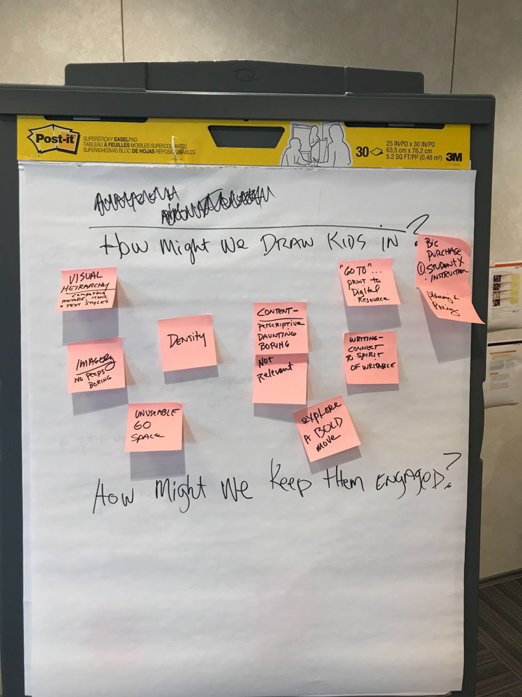
Engagement workshop
Print book audit and analysis

Deconstructing the legacy digital product
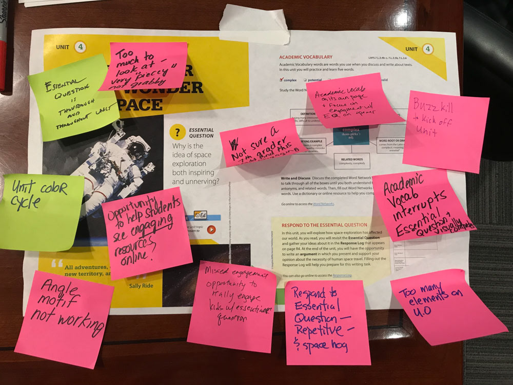
Every component was analysed in on the legacy product, fuelled by market feedback and a need to pivot to a SaaS delivery method, and get away from large product releases.
Change
• In order to succeed in the newly opened 2021 Florida market, an overhaul of the product was given a corporate green light and I led design into making more than was expected of this opportunity.
• An audit of styles led to strategic reduction and alignment, making decisions with a digital-first mindset
• Content divided by cognitive sections and load speed, not print page content
• To avoid outsourcing front-end dev work, I interviewed and mentored a new hire – a front end designer – who completely re-configured bloated baseline code and began coding our patterns inside the design team
• United a team around this vision to bring in QA, Learning Experience Design, and our internal back-end dev team through small trials, and constant communication
• Turned valid design research into an applied, repeatable design process
• With more ownership in the design team, I was able to direct a much higher quality of design based on a holistic vision
• Wrangled one of the US’s largest core education products from a 13,000-page complex experience into something we could build with just 27 repeatable patterns of precise, unified styling and in-built accessibility
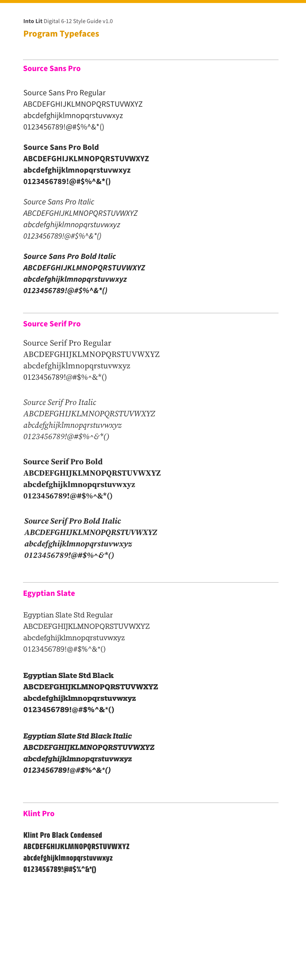
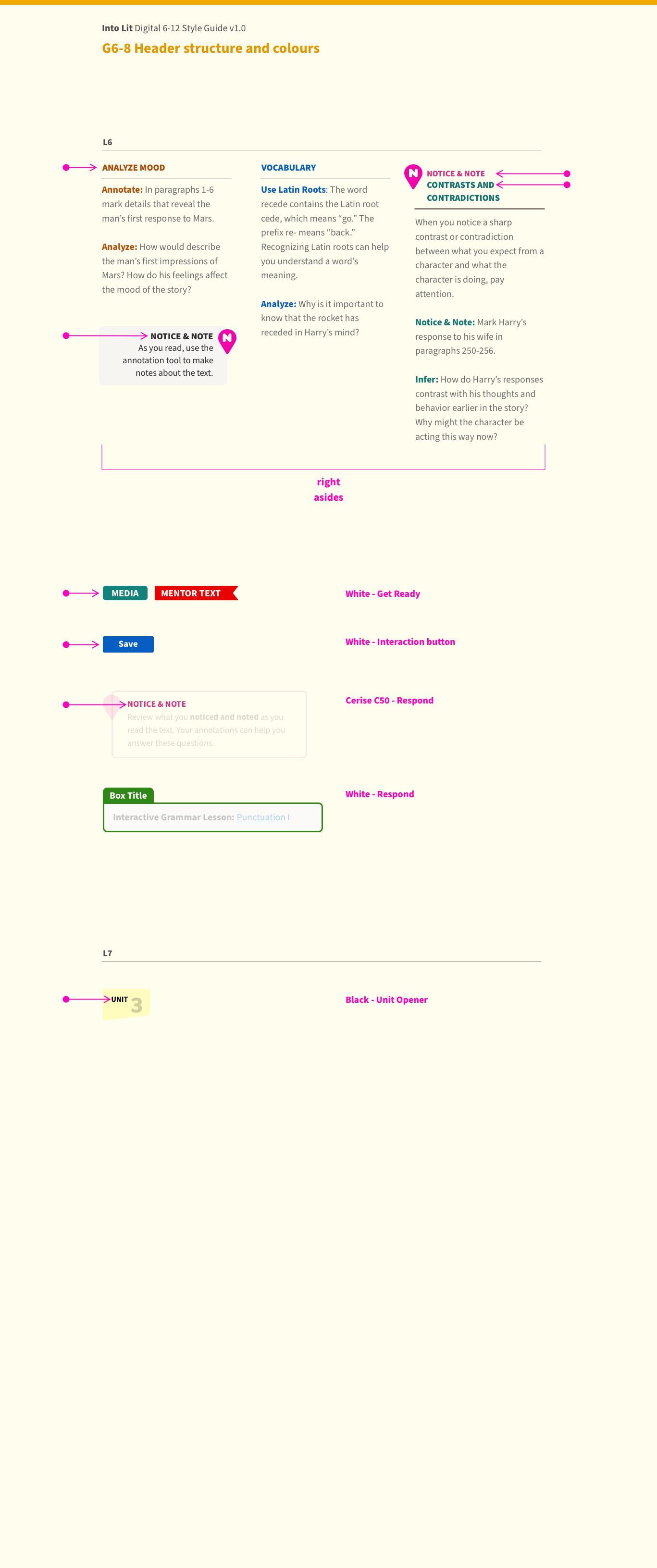
Typeface Choice and Header Hierarchy
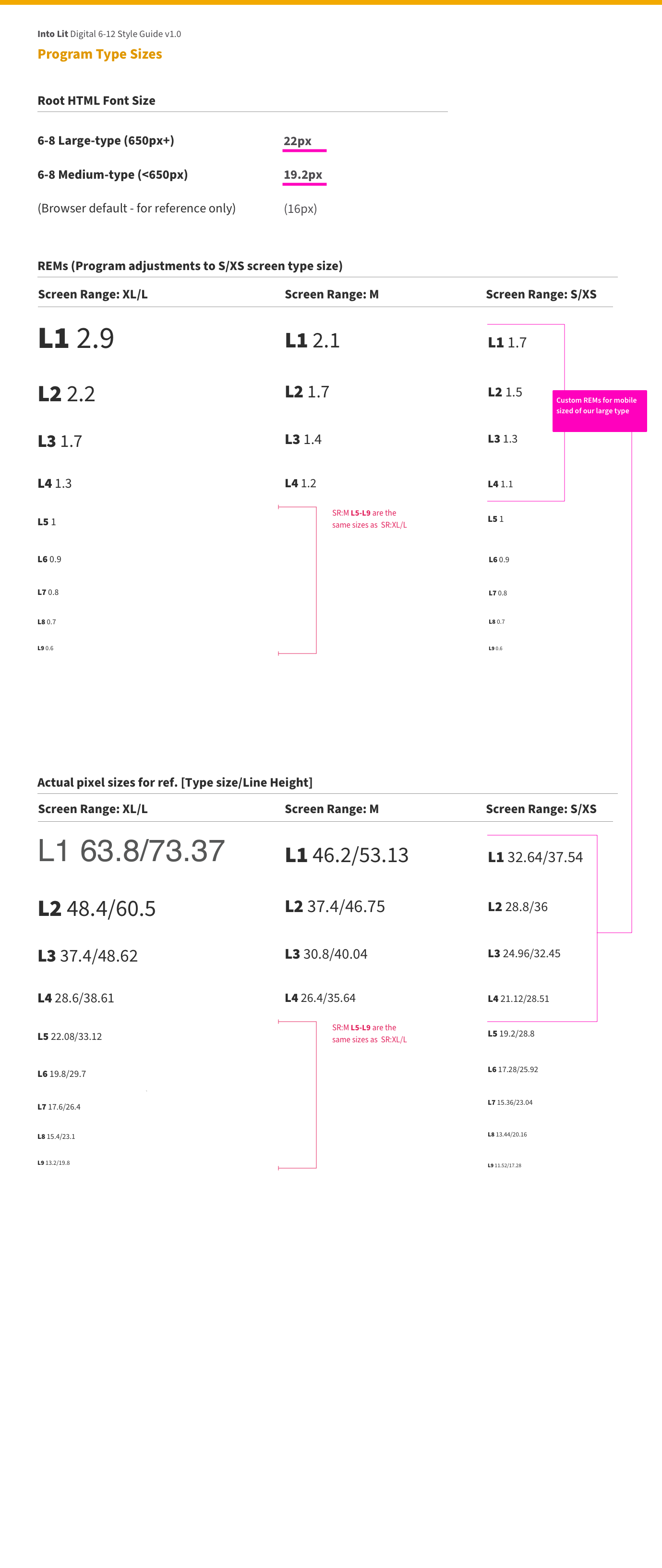
Type choices were based on readability, digital legibility and common usage. For body copy, the ideal character length for the age grade being served defined the grid and base type sizes. With a defined sizing structure various headers were aligned to a level of hierarchy, vastly simplifying what was coming from legacy print decisions.
Combinations of two sizes helped focus reader's attention to the most important information for the screen they were on. The nine different sizes were linked to the base code, avoiding duplicate and conflicting work.

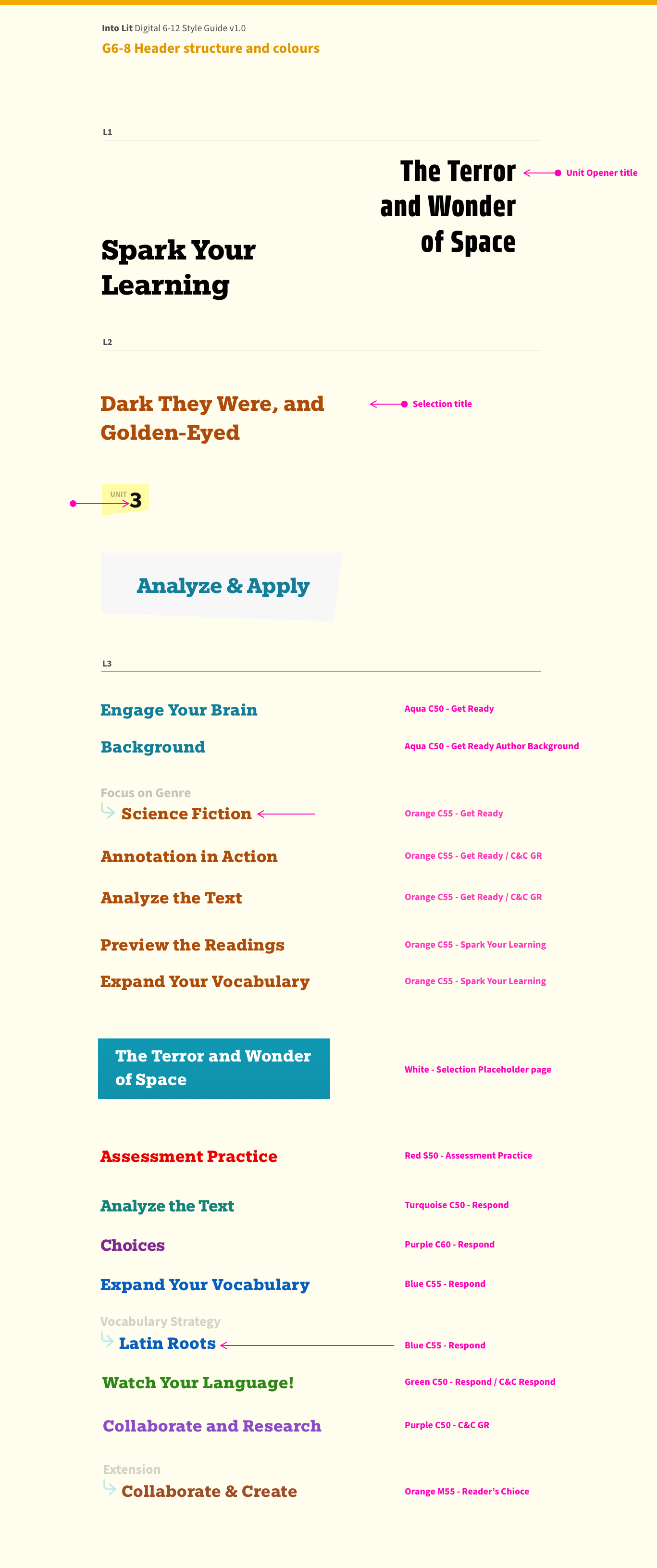
Colour style guides, general
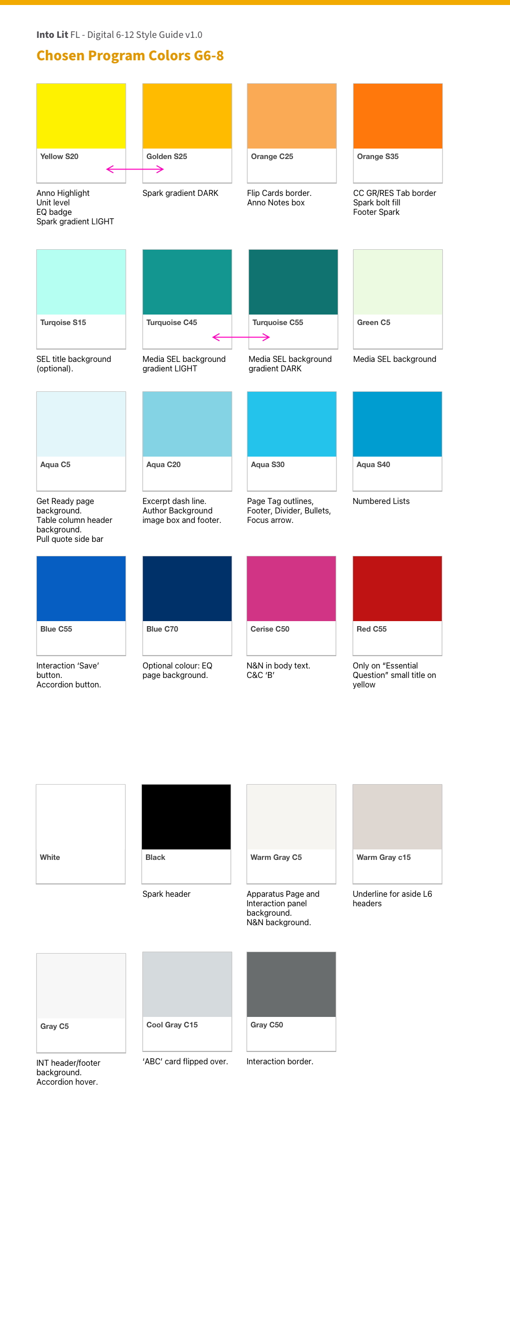
Colour style guides, Grade 6-8
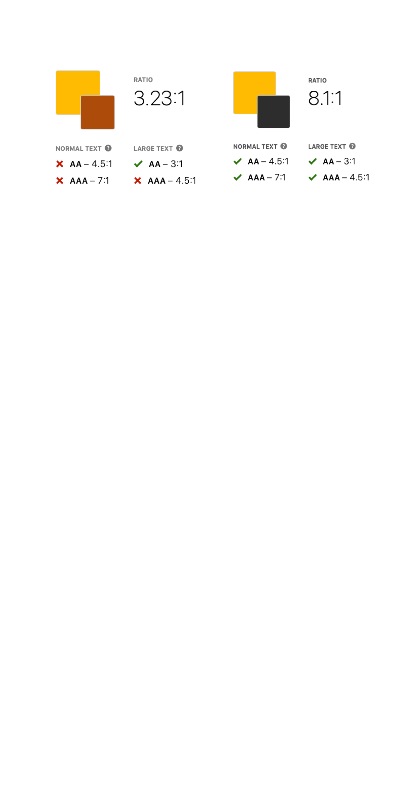
Accessibility contrast checks
Applying compliant colours with impact
Compliant and punchy section coding
Colour structure to aid understanding
Colour choice was made to honour some of the historical choices of previous products, but taking bolder and brighter variations as well as vetting each use case for accessibility contrast compliance.
Blocks of colour were used to make the learning experience inviting as well as defining sections, or focus areas on screens.
Text devices
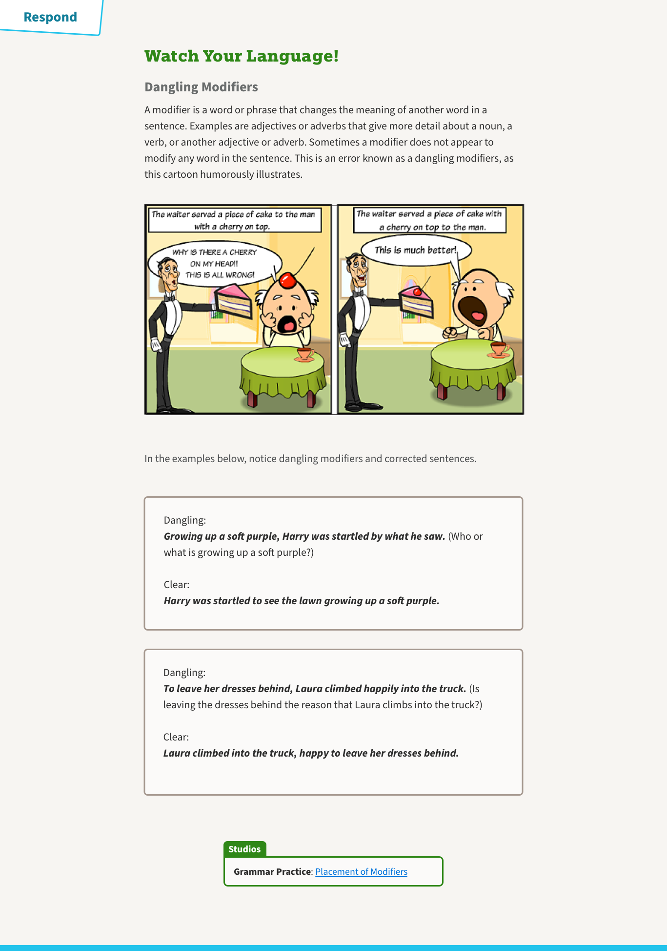
The sidebar has been an invaluable tool in teaching Literature. In print students are asked to use the margins to make notes, while in HMH digital there is a notes panel on a pull out drawer. We developed some sidebars to reflect the look of the digital note as an example.
Then, beside specific selections of texts we developed colour-coded sidebars to discuss grammatical, structural, and vocabulary sections. They were lighter in colour and tone so sat back from the more important text. In some cases we used icons to help define learning methodologies.
Success
• Despite being the largest product ever developed in HMH, this version returned the fewest QA bugs in our digital product history
• Baseline code was reduced by 74%. Total code reduced by 91%
• Entirely removed the need to vendor out front-end coding, a saving of almost $100,000
• The product began in Florida and has (in 2021) taken the Open Territory sales wins from 35% to 49% in less than a year, in a $520million market
• Drastically reduced friction between design and development
• Internal resources kept low with efficiency greatly increased: My entire digital design team was just one junior designer and one front-end designer
• Created a reusable system on a best-practice, accessible design framework
The journey through the product
The following show the path a student takes through the product and what was designed to help them stay engaged and enjoy this journey.
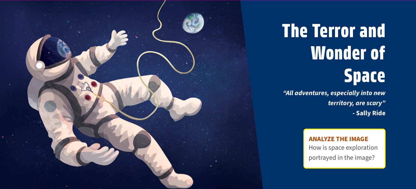
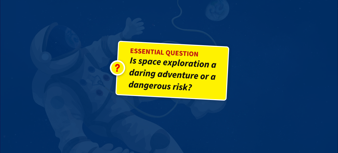
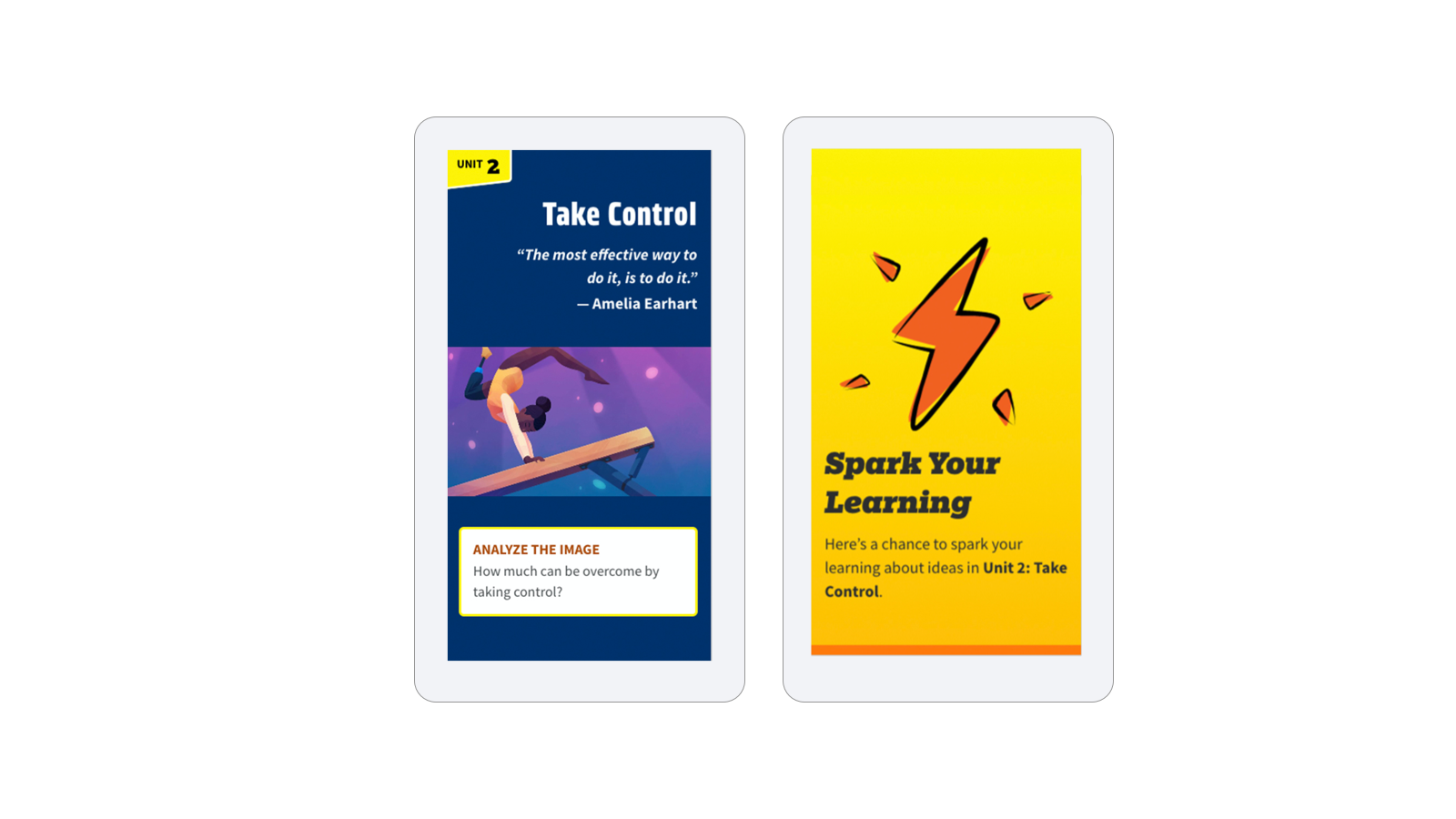
Unit opener: a bold illustration starts each unit with questions on it to engage students in the theme, from the first screen.
Splash opener with motion
Flip cards to encourage engagement
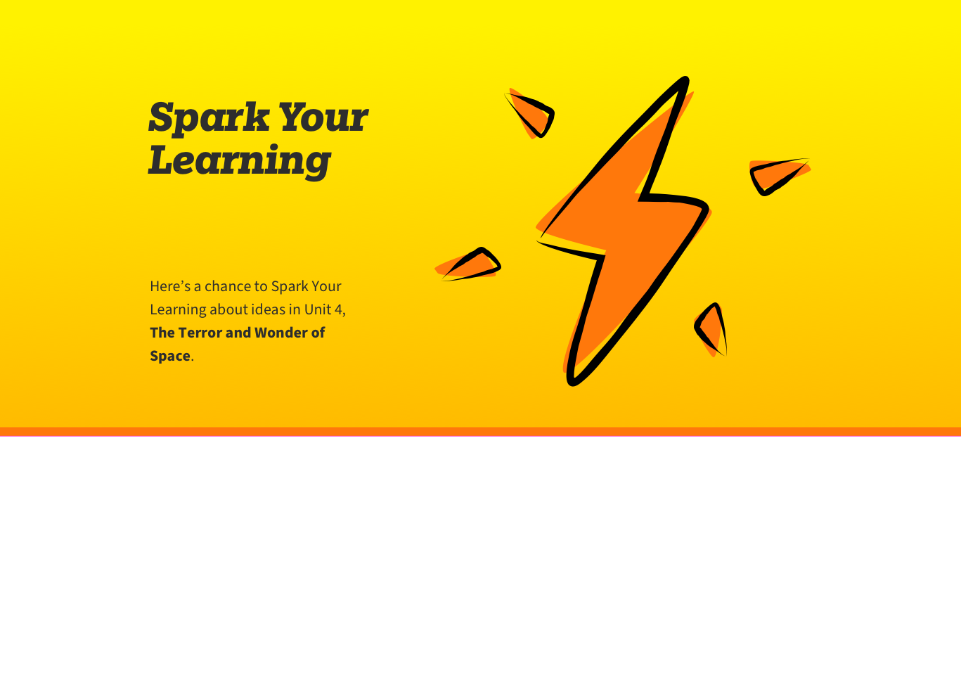
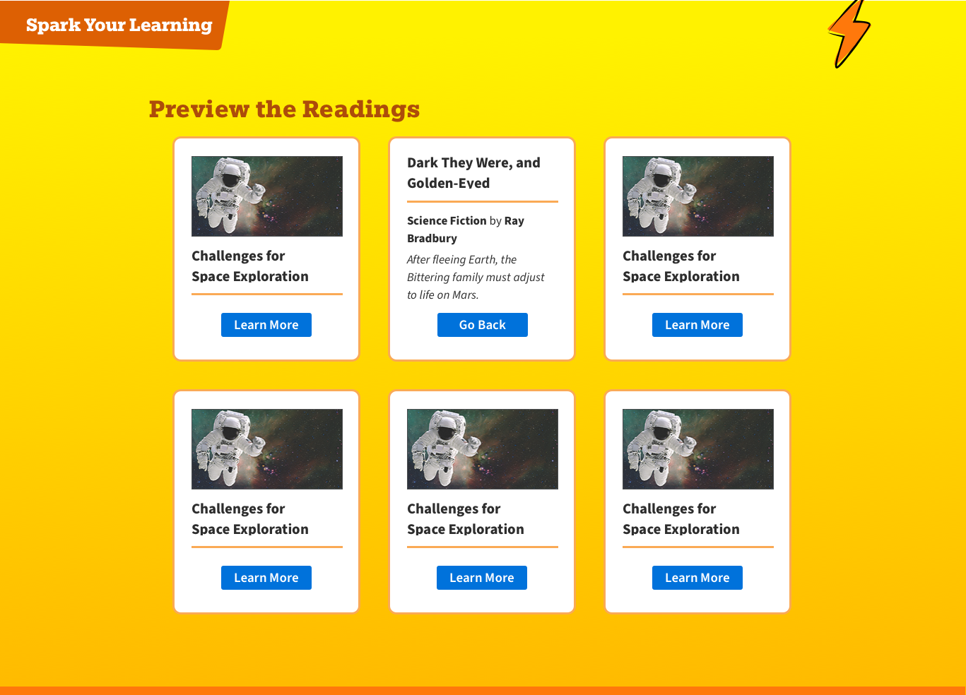
Spark Your Learning: A positive hit of yellow and motion on the bolt introduce the second section.
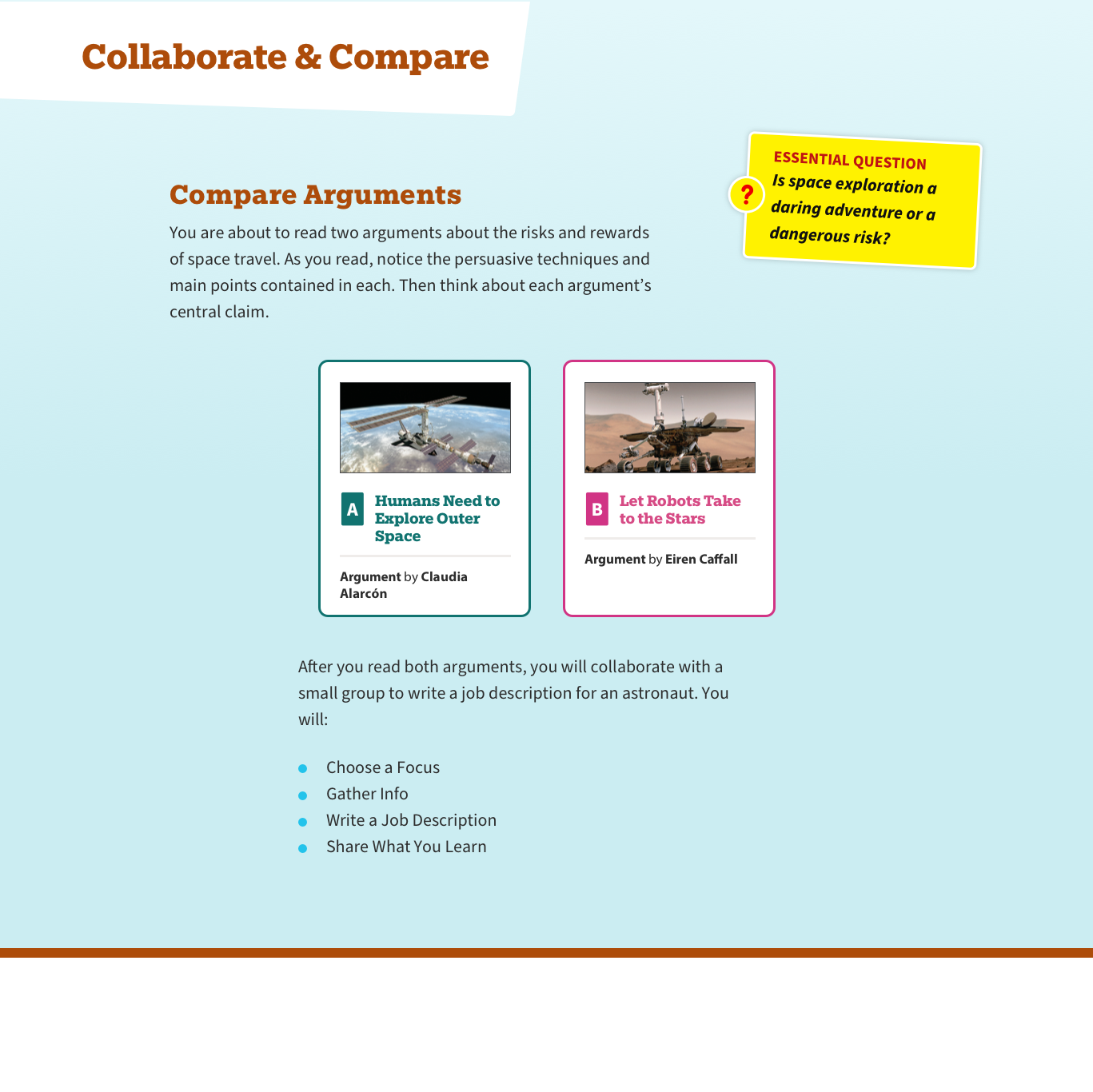
In Collaborate & Compare sections the text selections are presented as A and B (and in some cases C) cards, colour coded throughout.
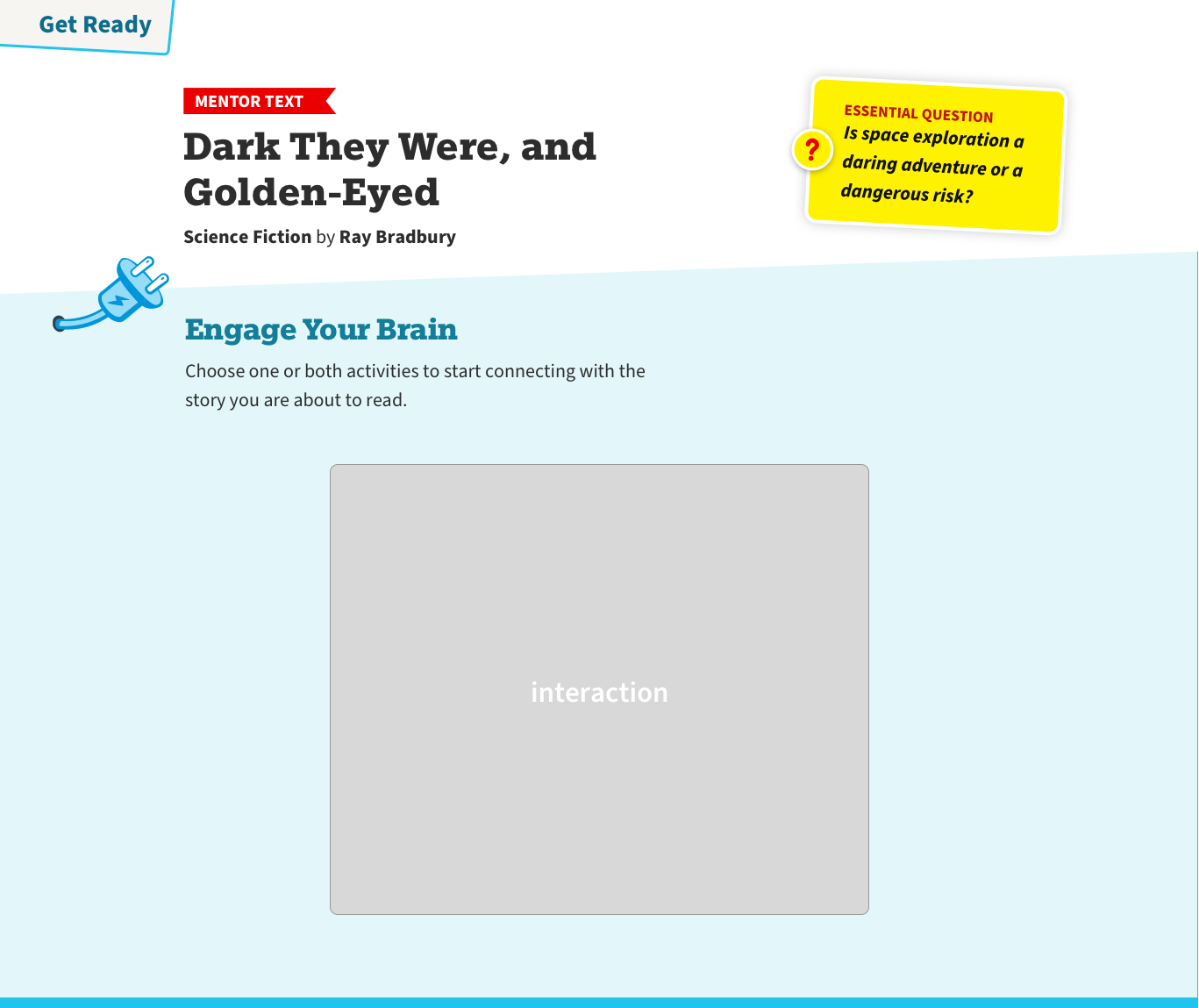
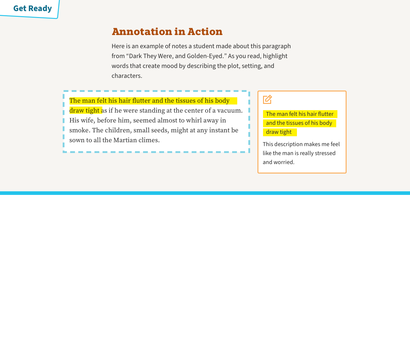

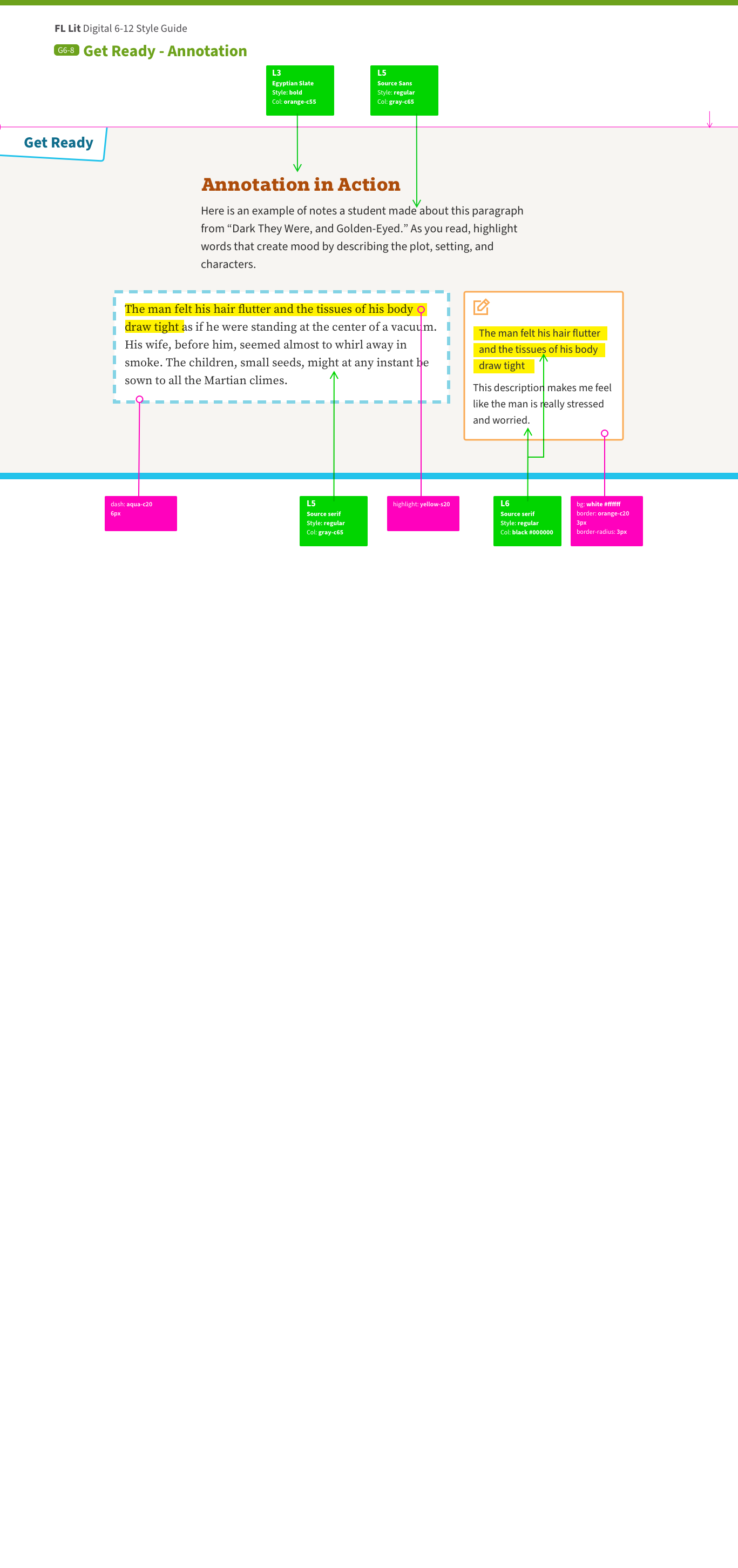
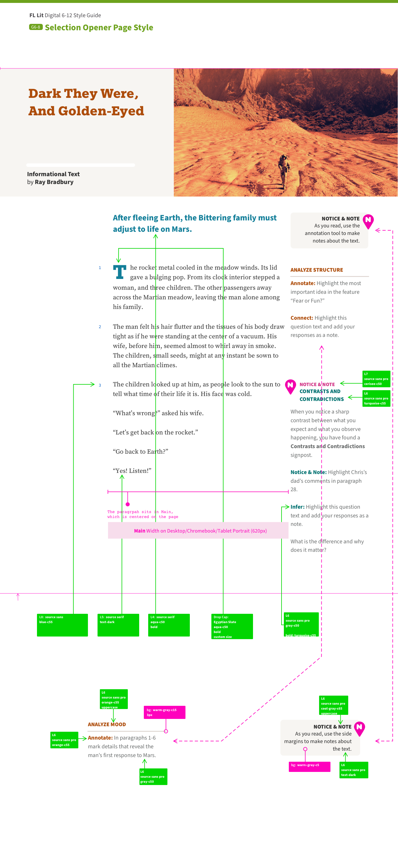
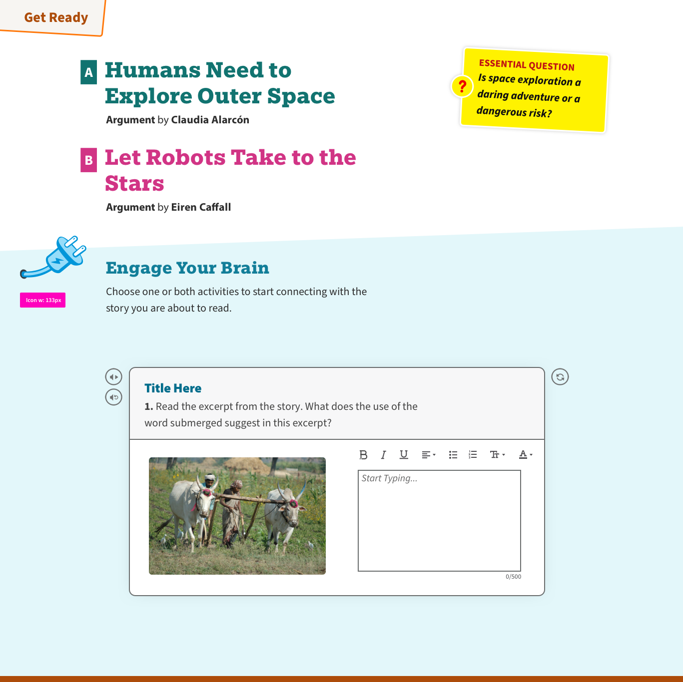
Get Ready: The student is preparing to read. They are presented with the context and history of the work, and told how to annotate as they go along.
The selections in this unit are presented as cards

The opener presents the selection to be studied
The opening screen ensures text begins above the fold
Interim panels break text up but don't confuse
End of selection clearly defined
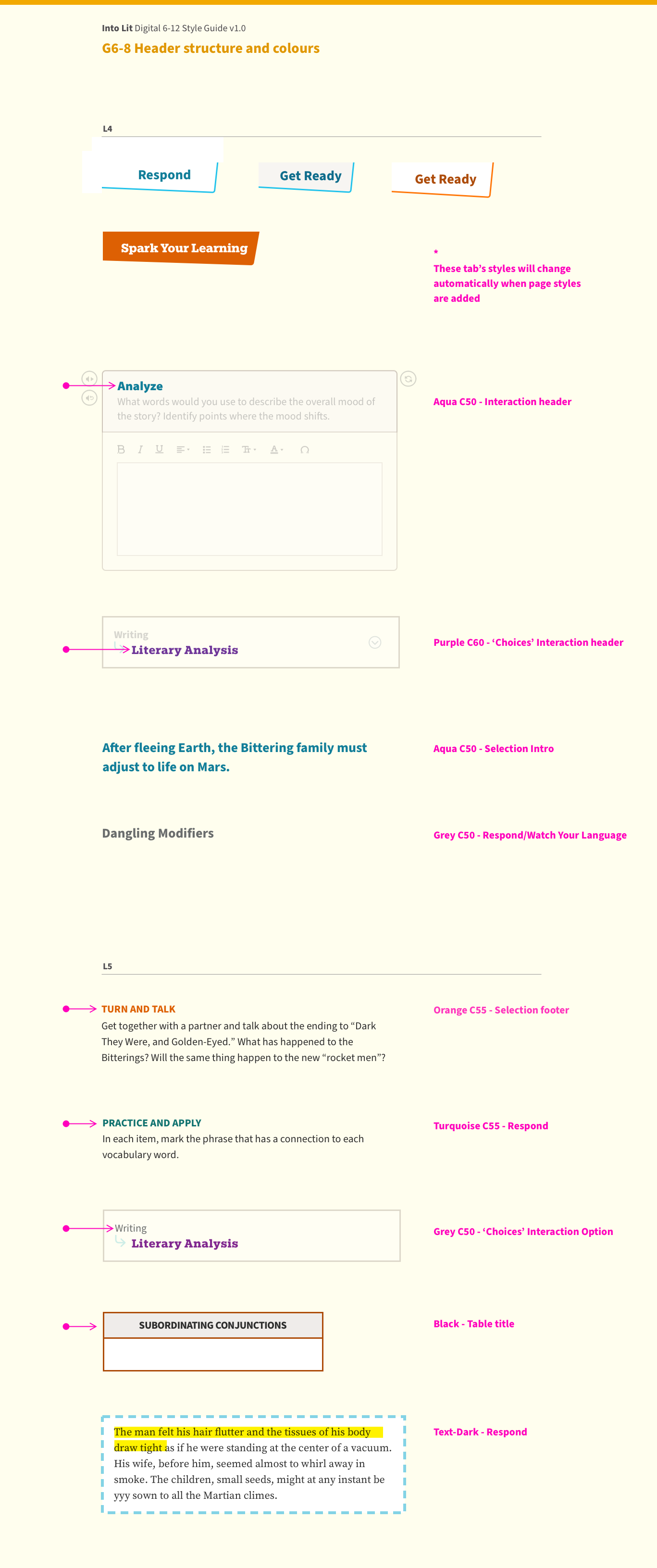
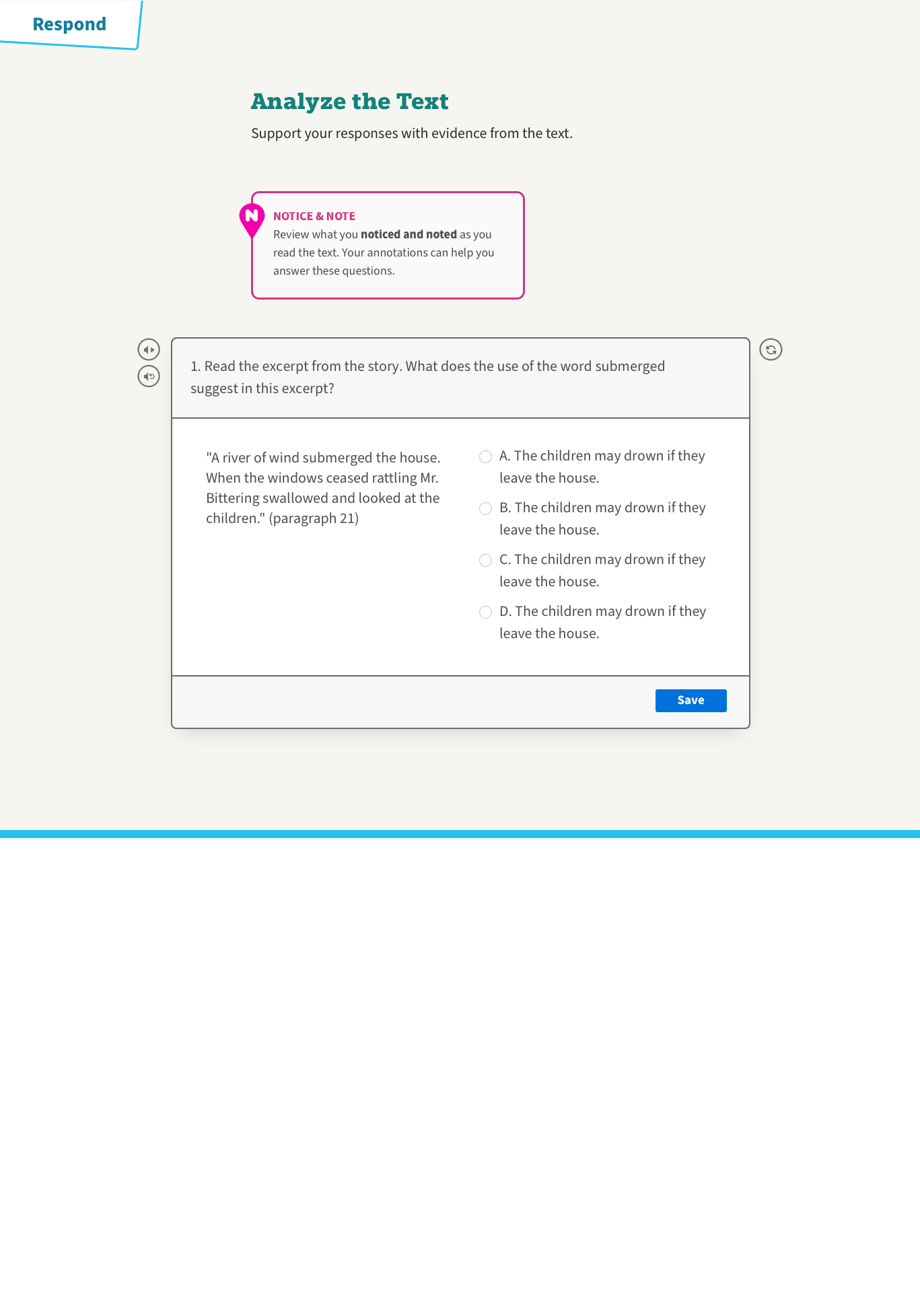
Selection text: The text to be studied is presented centred, in a serif typeface, while the instructional text appears in sans serif, set smaller and lighter to aid focus.
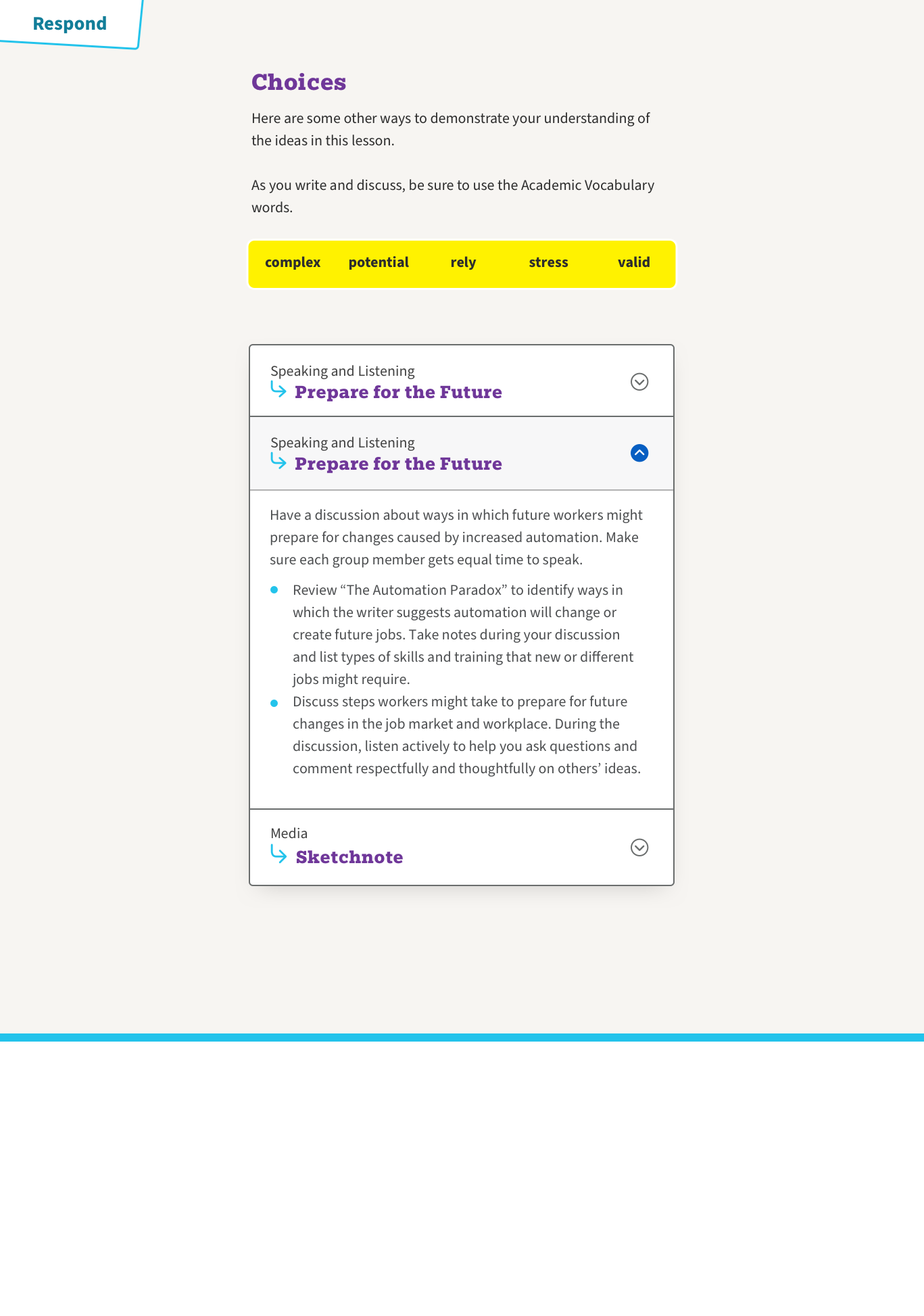
Respond: After reading, simple and clear blocks of information guide the students through their next actions.
Impactful colour delineates section
Panels and colour bullets break up heavy text
Concertina interactions reduce cognitive load
Colour and styles to differ example text from instructional
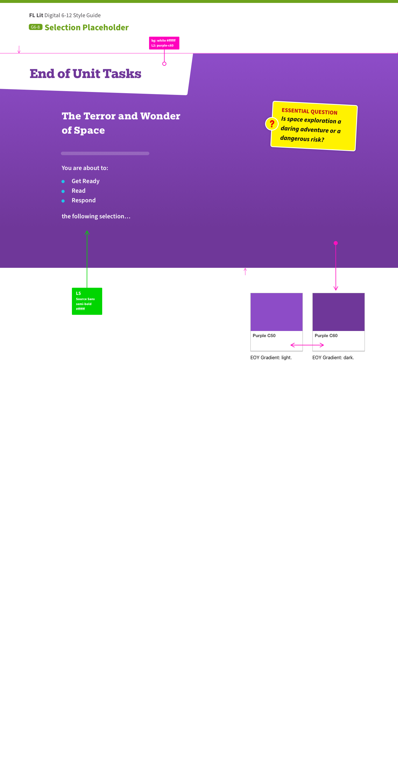
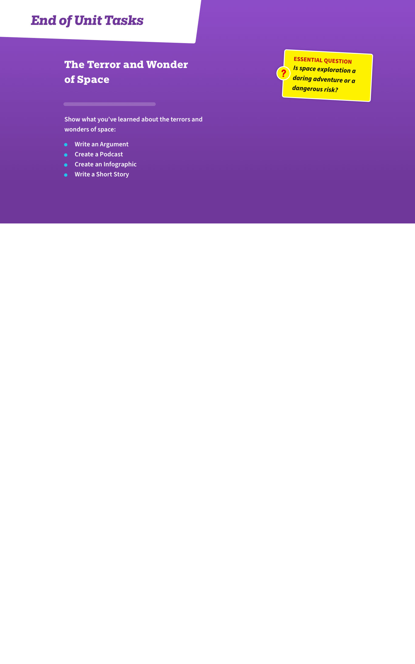
End of Unit: After reading a number of selections, another colour hit introduces the summary action for the whole unit. Text heavy screens are broken up with panels and interactive text boxes.
Final task uses positive colours
Options on final task are presented simply
Options on final task are presented simply
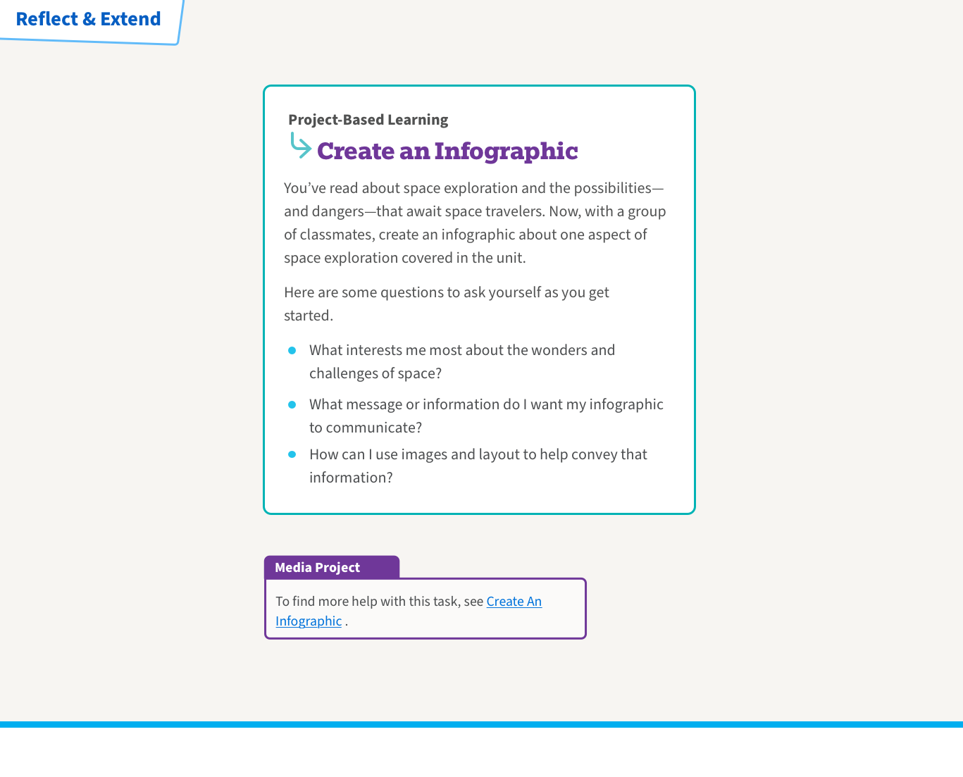
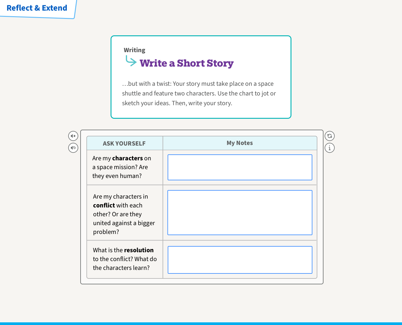
Reflect & Extend: The final action defines some projects students can undertake. The light colour and text-light screens try to end the unit on a light, positive note.
Some tablet and mobile screens below plus a video walk-through of the digital experience.

Get a walk-through of one of the live digital books in the video above.
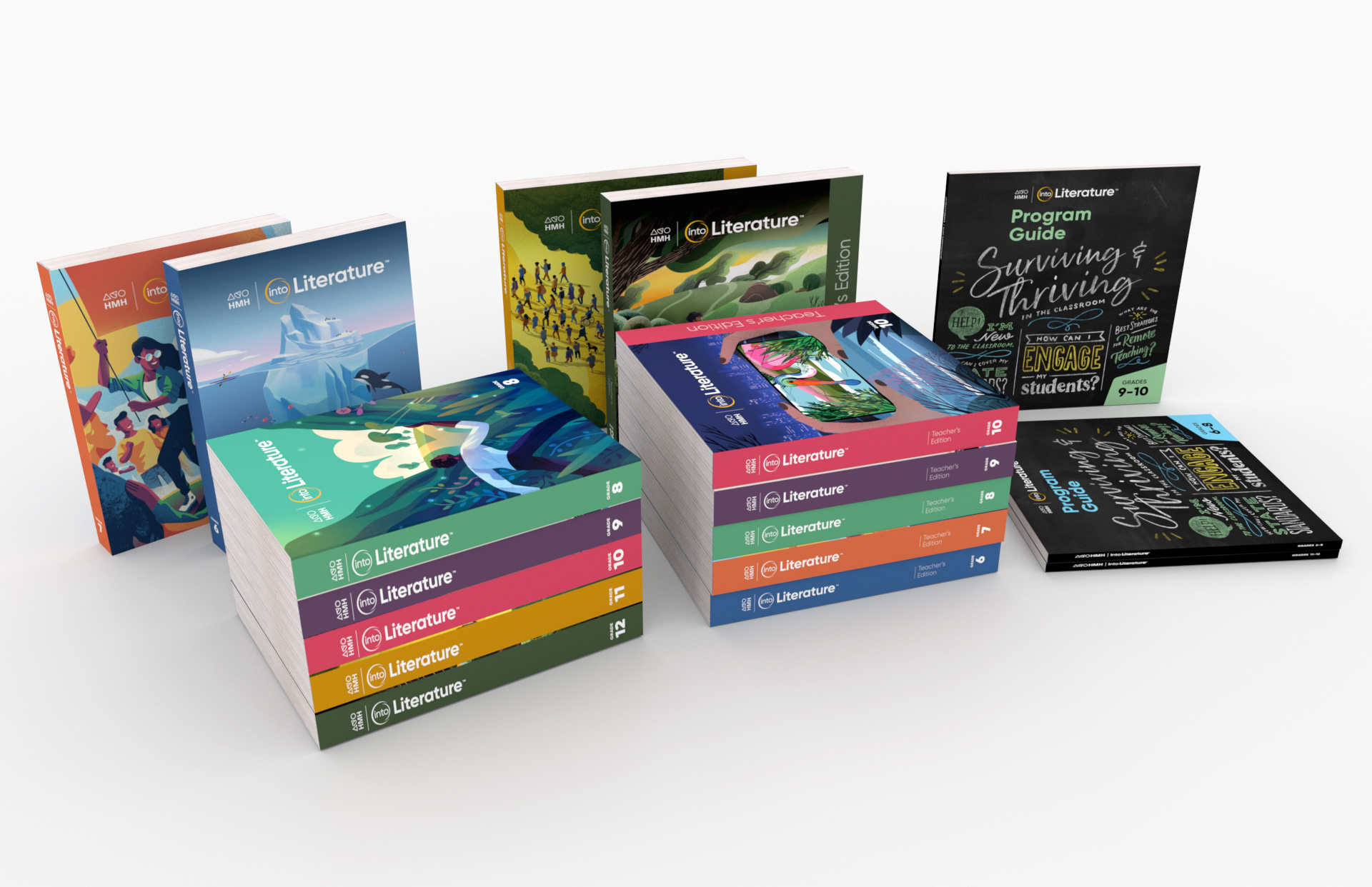
The print book covers for the updated Into Literature product.
Building future successes
Using Into Literature, we were able to create a new process flow which connected to the design vision, and the strategy. We used a design system that we also created on the back of this project, as well as building in accessibility to all patterns in the library where as we previously had to retro-fit this to the product.